Drawing a Battle Map Trees
In this article I hope to answer the age old question: How do you create your maps, Ross?
I have been drawing battle maps since 2015, and my method has evolved significantly along the way. I have no doubt that it will evolve some more in the future, but this post will at least serve as a useful time capsule for my method in 2020.
In these five years I have broken the map-creation process down into these stages, and I'll explain each in turn:
I must take a moment to mention that this is the method that works for me, and there's probably a different method that will be right for you! Give it a try, keep what you like, drop what you don't, and explore from there. That's the secret to any artistic journey whatsoever.
The Draft
It's time for that same lesson they teach in every art class you'll ever take: thumbnails!
This stage has a single goal, and that's to explore composition and find "the one" to follow through with. In general, this means to draw a wide range of small "thumbnails" and sketch as many varieties of the basic floor plan as you can imagine. The first thing to come to your head is often good but, five or six thumbnails later, you are likely to find something great.
You would do well to think about golden ratios, big-medium-small, and other compositional rules that are beyond the scope of this article. That said, even an amateur can draw twenty different versions of something on a piece of paper, hold it at arm's length, and pick out the best one. And, if you can't, very often the person to your left can!
After settling on a thumbnail composition, you should transfer this to your paper as a final draft that you will later ink over with your proper line art. I recommend printing out a sheet of graph paper from Incompetech for this stage (more on The Grid later).
Transfer your chosen thumbnail to this sheet with a pencil and a light touch, as you'll want to erase it after you've drawn your final line art over the top. I personally use a bright blue colored pencil for this, and I remove it digitally with Photoshop's color select tool.
That covers the method, but what exactly makes a good battle map draft? Allow me to share some of the things that I like to consider…
The Encounter
We're not drawing art to hang upon a wall or grace your desktop. No, our drawing demands blood to be spilled upon it, for it is a battle map!
Well, you might also use it for a skill challenge, a player base, or any number of things, but nine times out of ten it's going to be the stage for combat or some kind of action set piece. Suffice to say, keep at the front of your mind your map's purpose and how it's likely to play.
Let's break our encounter down into pieces…
The Clash
In the opening rounds, where will our heroes and villains begin, and where are the melee characters going to meet? In my opinion, you should aim to give these characters as many options as possible. You want to inject as much choice and strategy into the opening round as you can.
If the fighter leaps into the main chamber, the enemy orc might feint and take a flanking route instead. Will the rogue move to intercept, or will they take path number three to strike at the enemy healer at the back?
I tackle this primarily by offering several viable routes from one end of the map to the other. You might also provide two or more advantageous points – for example, high ground or active hazards (more on that later) – to force the fight to take place on several fronts.
That said, a choke-point battle or other simple clash is its own unique encounter all by itself! Not every battle should be a chess match, and variety is often the most important thing. It's nice to let your big fighters "hold the door" every now and then.
The Slog
What comes after The Clash? All too often it's a sequence of rounds of rolling dice and working from strongest ability down to weakest ability without a whole lot of moving around. In my opinion, this should be avoided at all costs! Though much of this comes down to the system you're playing (how powerful opportunity attacks might be) and the encounter design (how meaty the enemies are), we can also utilize our battle map to address the issue.
The most powerful tool in our map-making belt will be, for lack of a better phrase, additional or alternate goals that go beyond killing all of the opponents. Goals that force the players to reach and hold McGuffins, interact with objects on the map, and do other things besides slinging damage dice. For example, a sacrificial pit to which a conveyor belt is carrying hogtied civilians, phylacteries to break, or runes to erase which are empowering the big boss.
Just like The Clash, this is a rule that you should break often in the name of variety! A simple "team death match" with an opponent is always good fun, we're just trying to avoid being predictable and letting every fight become a "meet in the center and roll dice till there's a last man standing" situation. You can use one or all of these tips to accomplish that.
Hazards
Hazards – and interactable objects in general – are perhaps the most potent tool that you can employ as a map-maker. I like to separate them into two classes:
- Passive hazards are immobile things such as chasms, traps, and zones of wild magic. These are simple and effective ingredients to bake into your battle maps, and can add a significant amount of peril to the encounter! Go wild, but I would like to offer this one piece of advice: What happens if a player character falls prey to one of these hazards? If they fall into the bottomless pit, where do they end up and how can they join the party again? I often include stairways and elevators on maps that feature drops such as these because, assuming they survive, I'd like to be able to continue where we left off before the encounter. In another way of putting it, I don't want the stakes to be too great unless the heroes are facing a worthy opponent.
- Active hazards are dynamic things such as advancing flames, manually-operated traps, and interactable objects. In essence: things which tempt (or force) the combatants to move. They need not threaten your players with damage, either; I think it's often better to tempt your players away from their standard attack cycle with things like lever-operated traps, powerful scorpion turrets, and rickety, collapsible walkways that they can use to deal even more damage to their foe. That said, move-or-else hazards like crumbling floor sections and creeping lava also work a charm!
Hazards are an endless source of fun, but also something to use sparingly. Too many hazards on a single map is stress-inducing – just one set piece hazard will do! And, to harp on the same point as before, it's best to avoid being formulaic. Use variety as your central guiding principle.
The Grid
The grid is our unique artistic limitation as map-makers, and where we let the game supersede the art. This is hardly a bad thing though, limitations breed creativity!
I recommend forgetting the grid when thumbnailing, but paying careful attention when drafting your final design. Again, you can print off graph paper from Incompetech to help you with this stage. Just remember to use a light color that you can digitally remove later.
Your rule of thumb is a simple question: is the terrain type clear? Is it clear whether each grid square is passable or impassable (or difficult terrain, etc.)? If you bake the answer to this question into your map then your players will not need to ask it in the midst of combat.
On classic black and white battle maps this is accomplished with symbols and shorthand, but we can utilize those same tools even with a colorful work of art! Personally, I use these two techniques:
- Fill the grid square enough so that it's dominated by one terrain type. This doesn't mean you must draw every feature at ninety degree angles, only that you should strive to avoid any squares that are confusing. Equal parts floor and wall, for example. Your angled wall might creep into a passable floor space, but you should endeavor to let one terrain type "own" that space so that it's clear at a glance. At the end of the day, your goal is just to avoid the need for your players to ask questions like "can I stand here?" as much as possible.
- Utilize patterns to communicate certain terrain types. In particular, difficult and dangerous terrain. Think about the ways video game designers communicate long grass that you are able to sneak around in; it's usually grass of a uniform type, color, or height. We can use the same method of shorthand for all sorts of terrain. For example, I have a certain pattern for rubble. At the start of the encounter I point and say "this stuff's difficult terrain" and, because it's uniform in pattern and color, the players internalize it from that point on.
At this stage you have your paper or canvas before you and a semi-transparent draft drawn upon it. You've defined the grid, the major and minor shapes, and whatever obstacles and features you plan to draw.
Your draft can be as detailed or simple as you like, it all depends on your confidence in the line art stage. You might draw every detail and leave no decisions for inking, or you might only block in vague shapes and areas and go on with not much more than an enlarged thumbnail. Find what's right for you, and remember that you can always draft more details in even after you pick up your pen!
The Line Art
I draw my line art with paper and pen, but these steps will also guide you if you're drawing digitally. All this stage really entails is finalizing your draft lines, adding details, and – optionally – shading.
For battle maps especially I utilize bold and fine lines for different purposes.
Bold lines
You might think of these dark, thick lines as the map's skeleton. I use them to define important features of the map, such as ledges, impassable walls and objects, and features that demand the player's attention. They should be used sparingly for just this reason; they will fail to stand out at all if they are used too liberally.
Bold lines can also be used to suggest form in at least two ways. The first is for objects very high up, to suggest that they are larger and closer to the camera. The second is to use them sparingly in areas of deep shadow; I often speckle the dark side of treetops with bold clumps of leaves, and this does wonders for making them appear more three-dimensional.
It's a little bit of an oversimplification, but it may help to think of bold lines as necessary lines and fine lines as unnecessary lines. You could play out the battle map if all you had were bold lines because, to reiterate, you would at least have the skeleton in place.
-

These branches are close to the camera and drawn in a bolder line to suggest so. -

Bold lines define the walls and ledges – you could play on this map even if those were the only lines! -
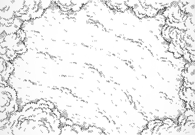
Bold lines are interspersed with the leaves here to give the treetops form, and used as a stark outline to separate them from the grass.
Fine lines
Fine lines are for the many details, texturing, and other flourishes you wish to include on the map. For battle maps in particular we use fine lines in order to avoid distracting too much from our ever-important grid. As a rule of thumb, I would reserve fine lines for two things:
- Textures, such as the tiling on a dungeon floor, leafy trees, and grassy plains.
- Prettifications, such as clutter on a desk, cross-hatched dungeon walls, and hatching in deep shadows.
Always endeavor to break up large patterns and avoid carpeting maps in evenly-applied detailing. A map with a large, even coating of detail is rather boring to the eye, and it would be better to cluster these details in big-medium-small areas. Also be mindful that detail (if used in this measured way) draws the attention of the viewer – if you have some central feature on your map, it deserves the biggest serving of detail!
Cross-hatching is a great technique for texturing and shading and there are more than a few ways to do it. When you use it, keep in mind that it can be mistaken for a pattern and that many players might read it as "impassable terrain" due to it being so widely used for walls in dungeon maps. It also constitutes a lot of detail, so be mindful again of your big-medium-small areas.
-

Here I use cross-hatching for shading immediately under the trees and in the treetops themselves. You can see how it suggests a boundary. -

Here I use cross-hatching to mark the impassable stone walls to this dungeon. -
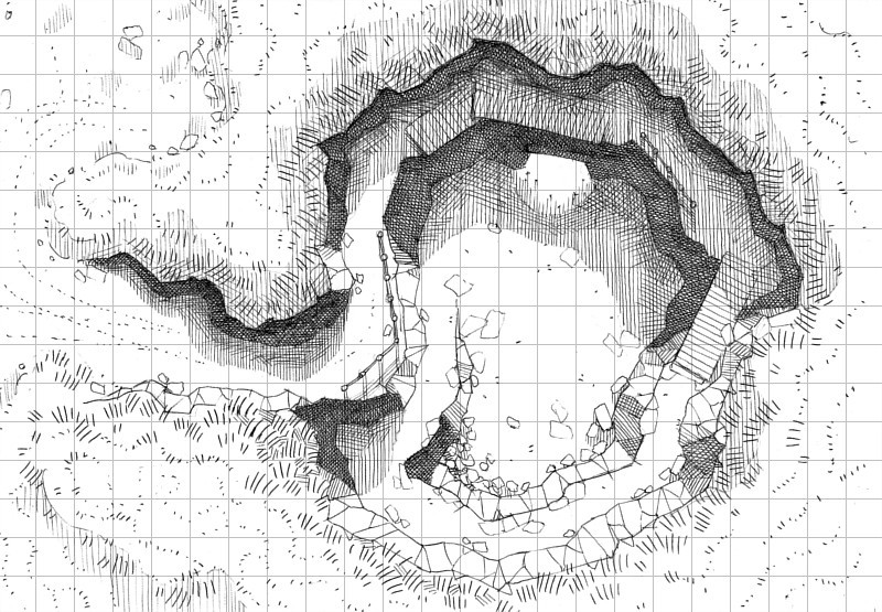
Here I use a form of hatching to define some dramatic shadows. Use with caution!
My Pens
As for the pens I use, these change all the time and I hesitate to make any recommendations. When I began I was using a simple, blue ball-point pen, and nowadays I use an array of fine liners and brush pens from Pigma. I'm still exploring different pens almost week by week so I don't currently have any that I swear by – just use what you personally enjoy and, if you have the money, try out a whole bunch of pens to find a favorite!
If you're new to drawing with pens then I would recommend grabbing a brush pen and a 0.1mm fine liner. If you can only afford one, then grab the fine liner.
The brush pen takes some practice to use, but is my favorite pen for bold and varied lines. Take it rather slow when you start out and over time you will be able to pick up the pace without spoiling everything. I use a brush pen in particular because you can vary the thickness of the line just by altering the pressure and angle of your stroke, even allowing you to taper gradually between bold and fine lines.
The fine liner is hard to go wrong with! It will be your tool for all the fine lines (as you've probably guessed) and, in a pinch, you can go back over your lines again one or two times to create a bold line too.
It Must Be Said: Practise Practice Makes Perfect!
It wouldn't be a proper drawing guide without me echoing this timeless saying!
One of the reasons I gloss over pen recommendations is because your tools are almost inconsequential when compared to your skill. So much of line quality comes down to muscle memory that can only be acquired through practice, practice, practice. When you see an artist draw a perfect circle in a single stroke, it's practice. When you watch them draw a effortlessly straight, even line, it's practice again. When a few hand twitches can produce the leafy contour of a tree, that's also practice.
When you start out, expect your lines to look awkward an amateurish. It's only natural! The more you draw them, the better they will get, plain and simple. Be encouraged in knowing that every line you draw is another step forward on your artistic journey.
That said, there are some tried and true techniques out there, such as how to hold the pen, how to utilize your entire arm, and whether to push or pull for certain strokes. These general techniques go beyond the scope of this guide and my teaching ability, so I just wanted to recommend looking them up on YouTube. If you want to take line art seriously, these techniques will give you an excellent foundation.
Now, a line art battle map has its own charm and is perfectly usable, but read on if you want to add color into the mix…
Flatting; Coloring Your Line Art
In this step we'll digitize our line art and begin coloring it. If you've drawn your line art digitally, you can click here to skip to flatting.
Scanning Line Art and Preparing it for Color
Your scanner doubtlessly has a swathe of settings just like mine, but what are the important ones? If you're using Windows I recommend utilizing the pre-installed Windows Fax and Scan program and using the settings below, but read on if your set-up is different.
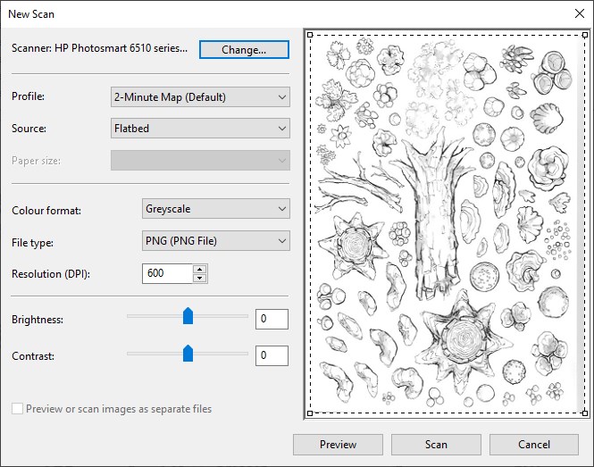
Chiefly you want to concern yourself with the "Dots Per Inch" (DPI) setting. 300 DPI is the standard for printing poster-quality illustrations, so I always recommend that you use that value as a minimum. That said, I personally scan at 600 DPI so that I have plenty of wiggle room to manipulate the line art; you can easily scale an image down without losing image fidelity, but scaling it up is a whole other ordeal. Suffice to say, bigger is better – BUT larger images do take up more space and require more CPU to edit. Experiment and see what suits you and your hardware.
Likewise, your scanner may have brightness and contrast sliders, among other settings. I can only recommend that you experiment with these in order to get a clear scan that includes the details you want. For example, tweaking brightness and contrast can make light lines done in pencil appear and disappear. Sometimes this is useful for scrubbing your image of draft lines, other times you may want to keep them.
Your scanner is probably capable of outputting to several different file formats too. Of these, you will want to export to JPG or PNG. JPG files are usually compressed in some way, so be mindful not to over-compress them and lose image quality, if you are given a compression slider at all. PNG files are larger because they are uncompressed – start with these if you're unsure. Whatever you do, don't use any "scan document" presets, as these are tailored towards outputting highly compressed PDF files, which are useless to you.
Importing Your Line Art Into Your Image Editor
Finally, your image is scanned! Now we will import it into your image editor of choice. Going forward, I will be using terminology from Photoshop primarily, but your image editor should also be capable of these steps unless otherwise stated. If you're not sure how, try Googling "how to [step] in [your image editor]."
Getting your line art ready to color is a simple, three-step process:
- Create a new canvas
Remember the DPI setting we used when we scanned our line art? Make sure to enter that same value in your new canvas settings (it may be referred to as PPI/Pixels Per Inch here) and then define the dimensions in inches. - Import your line art file
Dragging-and-dropping it into the blank canvas usually works, but your image editor may have a different or better method. Scale and position your line art just where you want it. - Set the layer mode
Set your line art layer (in the layers panel) to "Multiply" – this will transform it into an overlay and allow you to color on any layers placed underneath the line art in the layer order.
You may also want to tweak your line art further with image filters and adjustment layers before continuing. When you're done, simply merge all these layers into your line art layer and then set that to Multiply as described in step 3.
Flatting – What is it good for?
"Flatting" is a term that I borrow from the comic book industry (here's the Wikipedia page on it). Basically, it is a method of coloring where we carve out our base colors in separate color "flats." This makes it a simple affair to change these colors whenever we need to.
Comic book flatters traditionally flat on a single layer, defining their flats with distinct zones of highly contrasting colors with hard pixel edges (using a lasso tool or a brush with feathering disabled). This allows them to select these zones again at any point using the magic wand or color select tools – invaluable if you later want to change, for example, the flowers from red to blue!
Flatting in Photoshop
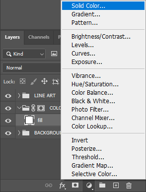
My method is a little different and utilizes Solid Color layers for added convenience; you can double-click these at any time and change the color using the color picker.
Any time you want to paint using this flat you will do so using its layer mask. Importantly, masks are edited in greyscale ranging from black (fully transparent) to white (fully opaque). This means that you will paint in white, erase in black, and any other value in-between will be proportionally semi-transparent.
Solid Color layers are automatically created with a filled layer mask, so creating one is likely to fill your canvas from corner to corner. Your first step after creating a new Solid Color layer is to invert this mask from opaque/white to transparent/black. Simply click their mask (see the image below) and invert it from white to black with Ctrl+I.

Now you can start painting your new color flat using a white brush, defining the actual color using the Solid Color layer! You can use any kind of brush here, with as much or as little feathering as you like.
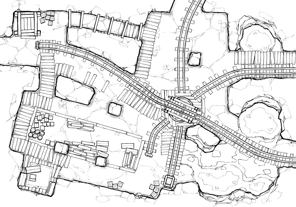
Here is the Thermal Mines again after I have filled in the "wood" Solid Color layer mask with a white brush. See how easy it is to adjust the color?
-

Here I have completed my "wood" color flat -

I can double click a Solid Color layer and change the color at any time – convenient!
Flatting is as simple as adding more and more Solid Color layers until the whole image is filled like a page from a coloring book. If you're concerned with staying within the lines, it's easier to flat with a high-contrast green, pink, or white that will stand out from the surrounding colors. When you're done you can go back through them and adjust them to a more realistic color palette.
Here is our Thermal Mines battle map again once I'm done:

A charming battle map already, I think, and perfectly playable! Something is missing though – but perhaps it's no surprise that color flats create a rather flat looking image! If you're up to the challenge, our next step is to add light and shade…
Rendering; Textures and Shading
In this short chapter I'd like to explain the simple method I use for rendering maps which, in truth, is just an extension of flatting for me; I do all of my lighting and shading in yet more Solid Color fill layers.
The simple difference is that I use gradients, opacity, and some homebrewed Photoshop brushes on these rendering layers, which I usually break down into the following in order:
Glows surround lanterns, fire, and other sources of light. Often, I personally use a combination of a hard brush and a radial gradient to help lift these areas out of the dark.

Highlights are used very sparingly for reflective surfaces, such as metal and smooth palm fronds. I don't use them much at all, but they pack a lot of punch when I do.
I don't often use special layer modes for glows or highlights, but sometime soft or hard glow works well.

Hard shadows are shadows with a clear shape and form, such as directional shadows cast by trees, buildings, and objects. I use a square brush with very little opacity and fill these shapes in rather like another flat, and then I adjust the opacity of the entire layer later on to get the right depth of darkness that I want. I also use this layer for ambient occlusion, or the shadow that collects in nooks, crannies, and other cramped areas.

Soft Shadows are something I use for elevation changes, gradual slopes, and all other areas of shade which I'd like to be about half as strong as the hard shadows. I keep these on a separate layer so that I can adjust their opacity separately, giving me a lot more control over the overall contrast. I use a soft brush and the gradient tool for these.

Mottle is the name I've come to use for general texturing, and this is a layer where I get experimental with brushes and strokes in order to suggest grass, water ripples, sand, and other textures. Often I will adapt textures I have made in the past, and that's what I suggest you do too! You can find my collection here.

It doesn't seem like much when these five layers are listed like this but, working together, they really do sum up my whole technique!
One more general tip I have is to never use black as a shadow layer color. Trust me! A near-black blue or purple will always look better, in my opinion. As for highlights, I suggest a fiery yellow or orange depending on the context. The reason we utilize Solid Color layers at all here is so that we can play around with these colors, so commit some time just to experimenting with them. 🙂
Conclusion
This sums up my entire thought process from draft to finished battle map. I hope that it serves as a useful guide for you to try your hand at making battle maps too! If your passion goes beyond your private games like mine has, I also hope that your journey will go far beyond this method, and that you will embark on the never-ending, ever-fulfilling journey of developing your own style.
Good luck!
Subscribe
Here are all the ways that you can keep up to date with our new content, be it on social media or with our email newsletter:
For exclusive map variants and even the PSD files, consider joining the amazing community that makes these maps possible:
Source: https://2minutetabletop.com/how-to-design-draw-battle-maps/
0 Response to "Drawing a Battle Map Trees"
Post a Comment